Plaque Direct E-commerce website
Build your own plaque online
Overview
Plaque Direct helps people customize and create their own unique plaques with individual care.
Many of the plaques are made for commemorative reasons, which might come with high emotional value that connects the buyer to their loved ones. For this reason, building trust and care between the customer and the people who work on making the plaque is of high value.
The aim of this project was to solve the problem of generic or bland designs that don’t fit each personal case through a detail-oriented order form, and interactive design service.
Duration
March 2020 – July 2021
My Role
I worked on this project as a solo designer for the desktop & mobile website.
I was responsible for the entire design process from brainstorming, wireframing, prototyping, visual design and branding, incorporating user feedback into design iterations, and quality assurance.
The Problems
- People have to contact the shop directly in order to make a purchase, they require in-person consultation and support through calls, emails, or physically going to the shop. This creates a great deal of friction and frustration between the customers and the business.
- Customers are unable to visualize their own plaque, oftentimes resulting in dissatisfaction with the end product.
- Inability to detect typos and errors prior to production, and can result in serious delays and unwanted costs.
- A limited variety of templates and generic designs with only a few types of fonts, graphics, and layouts available to choose from may result in a less accurate representation of what they are trying to convey.
- Our hypothesis was that outdated content and low-quality visuals are one of the main reasons customers are wary of paying online for something of high value and cost.
How might we make the order experience precise and efficient for customers to complete easily without having to contact support?
In order to solve these issues, we wanted to create a modern, trustworthy, and user-centric platform, and provide each buyer with a graphic rendering of their plaque to review and revise prior to production.
The Solutions
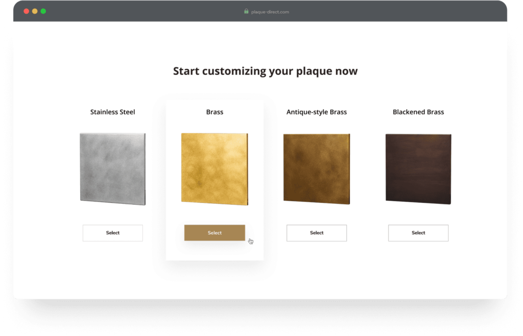
Order a plaque online in 5 easy steps
A smooth order flow guided with visuals and texts to describe the different options.
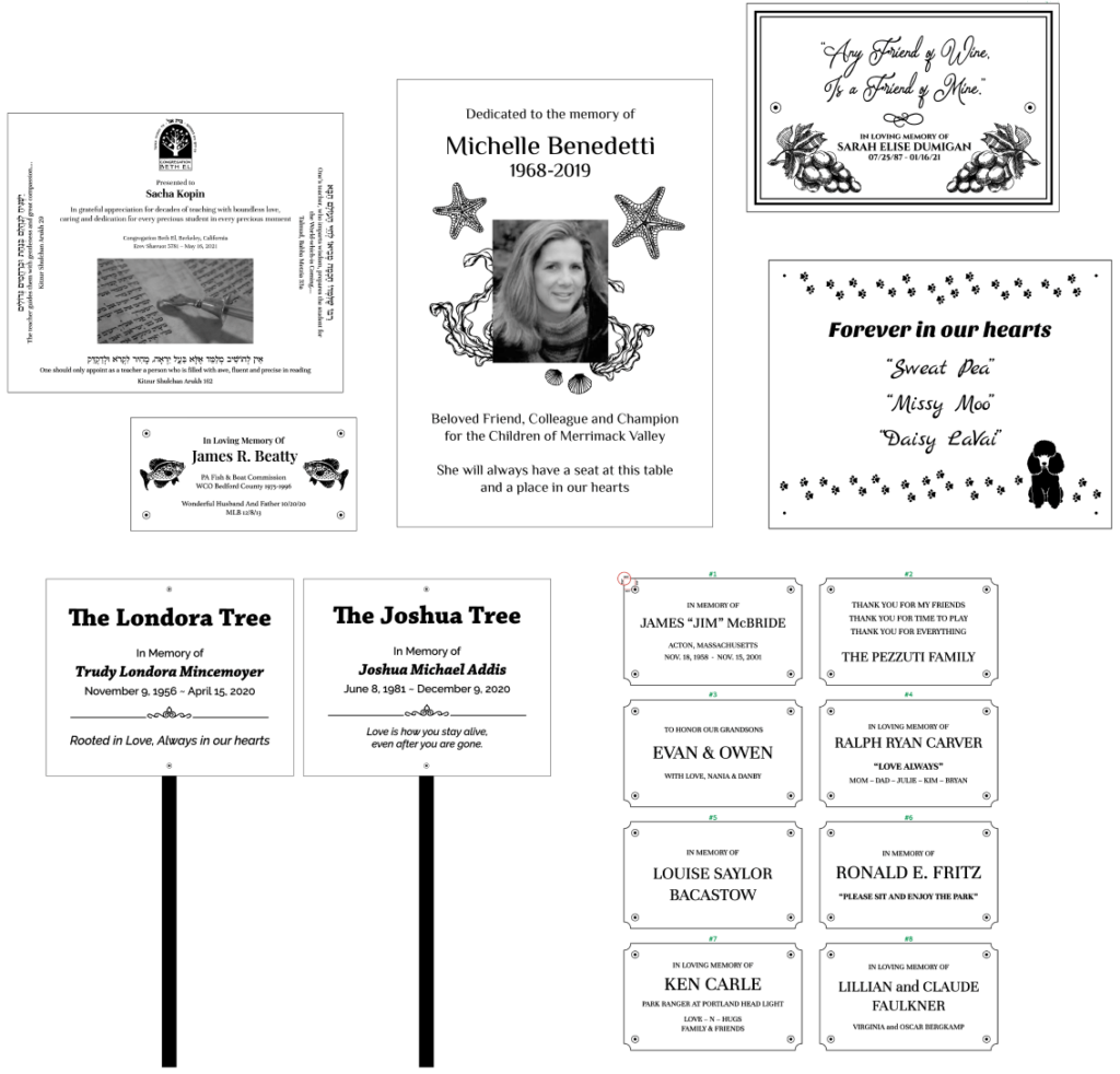
Personalized Design services
Choose to use the shop’s professional design service, or provide a design file and save costs and time.
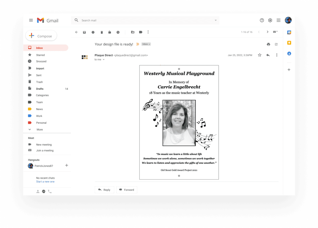
Design proof file within 24 hours of placing an order
Get a personal design file through email to review and change as many times as needed before production.
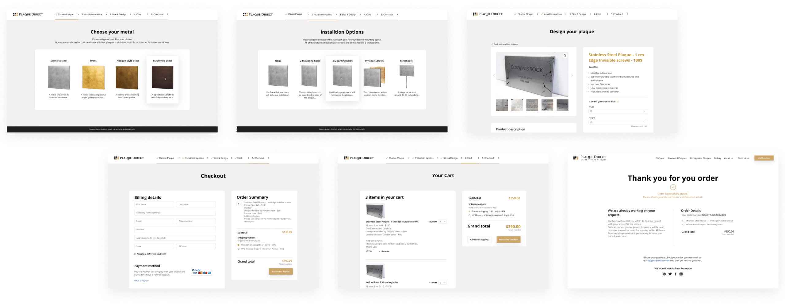
A consistent approach with visual branding
Attention to usability, navigation, and readability throughout the website.
The framework
Getting started
There are many motives for people to purchase a plaque such as commemoration of loved ones, appreciation to sponsors and donors, special events, informative signs, and more.
This led us to understand we’re dealing with a wide and diverse audience of buyers.
As a partner to the company, part of my work includes engaging with the customers daily, thus providing me with a deeper understanding of the customers and their pain points, but most importantly – allowing me to empathize with them. With this big of a benefit, I gained a better understanding of who and what they truly struggle with but also inspire possible solutions.
With the problems clearly stated and established, it was time to focus on solutions. The next steps included ideation, sketching, and prototyping a few options for possible features that will improve the overall user experience.
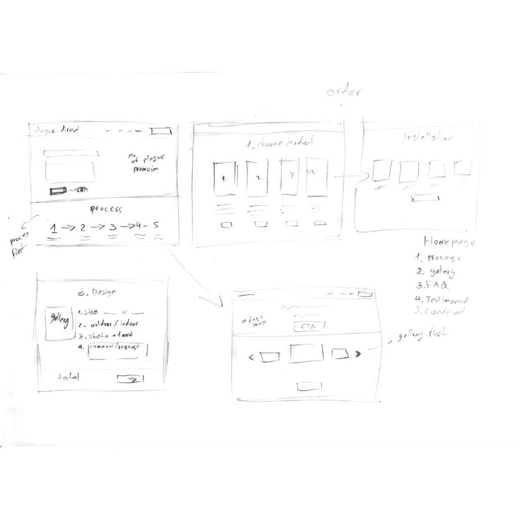

The process
Brainstorming ideas with the stakeholders
learning more about what the order process consists of, what necessary information needs to be collected in order to design a plaque.
Determining priorities
for this, I used the MoSCoW method.
What do we absolutely need to kick off the website and launch as soon as possible? What would be good to have or should be left out if it delays launching? What do we hope to do in the future to further improve the experience?
Building architectural flow
The website offers multiple products for different purposes and target customers, so we want a page for every purpose and need. We sorted those pages into a basic navigational structure, stemming from the homepage.
Sketching the different interaction patterns
wireframing the order flow and prototyping the website as a whole.
The Impact
“People will forget what you said, people will forget what you did, but people will never forget how you made them feel.”
— Maya Angelou
Plaque direct is a small family-operated business that started locally in Jerusalem and is now selling to hundreds of customers in the US, Canada, and sometimes other parts of the world thanks to the new website.
Within a couple of months since launching, there has been more than a 40% increase in sales and a significant decrease in inquiries. We get feedback and positive reviews from customers every day on how the products not only exceeded their expectations but also helped them get closure with their loved ones.
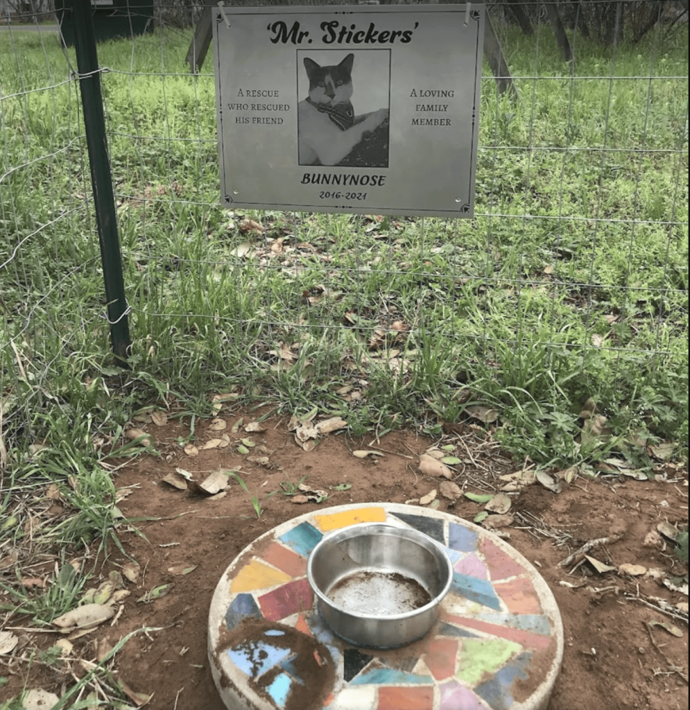
Plaque direct e-commerce shop makes it easier for customers to communicate their needs and get products that impact hundreds of people’s lives and memories.
REFLECTION
Looking back, we say this project has been made with our blood, sweat, and occasional tears. But, with that being said, it holds tremendous value to me as my first solo UX project, and for the shop’s owners. This was definitely not a single iteration process—working together with the developer, I had to be mindful of certain technical limitations. On top of that, being the only researcher and designer with limited experience at the time, there was a lot of trial and error along the way.
To be continued?
This project is by no means finished. After 2 years from the initial launching, we gathered enough new information and much bigger pictures of our client base and the problems we are looking to solve.
I’m currently taking part in a re-thinking and strategizing process, adding more experts on our team to improve parts we didn’t have the resources or funding to work on at the time we started this. For the future project, I would start by conducting deeper initial research, benchmarking our performance, as well as thorough user testing. Re-launch is targeted for this year.